5 Must Have CTA Elements to Increase Website Conversion
Asking your website visitors for the sale or other form of engagement is one of the easiest things you can do to improve your website. You’ll be surprised to see just how many companies struggle with Call-to-Action (CTA) buttons.
CTAs have a very specific job: Get website visitors to take an action on your website. That’s it. It’s one of the easiest things a company can do to increase engagement and sales. In Marketing Made Simple, Donald Miller advocates thinking about calls to action as if they were cash registers for your website. Your site needs easy, visible ways to do business with you. Your “cash register” should be a clear beacon for people to notice when they are ready to take action.
Here’s five must-have elements you can use to improve your website conversions.
1. Language.
Choose active language that sets a realistic expectation for what the user will see or be asked to do once the button is clicked. Using a short benefit statement helps web visitors understand the value of taking action. Microsoft Xbox keeps their CTA simple and active. “Join now” conveys precisely what a user needs to do to get the Xbox Game Pass Ultimate*. There is no confusion for the user. Avoid vague phrases and calls to action and like; “Learn more”, “Click Here”, or “Submit”.

2. Location and Frequency
As in real estate, location is very important. Same goes for CTAs. As the average attention span shortens for all web visitors most companies only have a few seconds to engage people before they leave a website. Place your primary call to action in a high-profile above the fold location on your website. Use your CTA buttons in as many different locations across your site where you want a user to take action. Make it easy for customers to not only know how to engage but where to click to take action.

3. Color Consistency
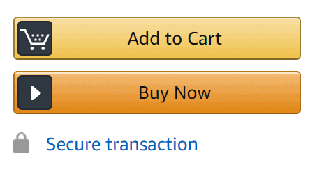
Highlighting your CTA button using contrasting colors to the background or other design elements on your page. Consistency matters as the eye will learn to differentiate between graphic elements on your page. Amazon.com does a fantastic job of staying consistent with their button color. They are so consistent you would be hard-pressed to not know which button to push to take an action on their site. Help make your CTA buttons stand out with great color choices. The psychology of color for your buttons can also make a difference and attention to how well the color plays with your overall brand identity should not be overlooked.

4. Differentiated Button Hierarchy
Many times you’ll have a need for a direct sales call to action like; Buy Now, Register Here, Get Started Now, etc. while other times your visitor may not yet be ready to buy what you are selling. Some visitors may need a transitional call to action. This is essentially a path for them to gain new and valuable information about your company. To you it means they enter a nurture stream. For transitional CTAs opt for a toned down button design especially if you are giving a user the choice between a direct CTA and a transitional CTA. Invision does a great job of very simply and clearly differentiating between their button designs. Bright pink is their primary call to action to drive sales and the black underlined message is the transitional call to action.

5. Short Button Text Length
Keep it short and easy to understand what is about to happen next. West Elm’s website keeps their button CTAs short, sweet and direct.

Refine your website
Review your website and identify areas where your own calls to action can be improved.
Recent Comments